


Ron Perkins
Senior Interactive Designer
AT&T; Interchange Online Network
25 First St.
Cambridge MA 02141, USA
Tel: 617-252-5231
E-mail: ronperkins@ichange.com
One of the major problems confronting users of large
hypermedia spaces is getting lost in hyperspace. An
overview diagram of the information space can help [1].
Work at Bellcore on visualizing information with fisheye
views demonstrates the usefulness of the technique but
requires a highly structured hypertext [2]. There is some
evidence that a hypertext organized both as a hierarchy and
a network is more efficient than strictly one or the other
[3].
The structure of Interchange, which simulates a hierarchy
but is actually a network, incorporates both means of
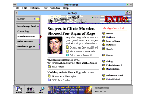
navigation using hyper links. Below is a directory page for
the Washington Post(tm) showing a standard navigational
structure. The special interest publishers are listed down
the left side. Photos and direct links to highlighted stories
are in the center. In the Post, under the word �Extra' is a
index listing with all the major sections of this publisher.
Figure 1. The Directory Page for the Washington Post.
Running under Microsoft Windows ((tm)), and accessible via
modem over telephone lines (soon over the Internet),
Interchange allows compound documents that support a
wide range of media types including graphics, styled text,
and links to any other item in the service. The document
architecture is easily extended to support video and sound.
Editors can highlight new content daily, hourly, or by the
minute. Users can customize information by organizing
their own view of the entire network of services. They can
create saved searches that function like simple agents to
monitor information constantly. Users can save
information off-line and connect to update the information
on their PC as well as set up automatic dial-up sessions.
Finally, they can participate in online discussions about the
topics in each special interest area and talk to editors: this is
where the community is formed around shared information.
As a next generation online service designed specifically to
take advantage of the Windows environment, the interface
is notable for it's simplicity. As a result of numerous
design iterations the complexity of this full featured online
service is presented with an interface that has a browsable
navigational structure, minimal menus, and simple search
tools. In fact, computer professionals may find the
interface unremarkable for the apparent lack of never-
before-seen interface conventions. We consider it a success
if customers find the information they need and do not
consciously notice the interface itself in the process.
Major feature innovations include:
Figure 2. The Beta design for Interchange's Central Directory.
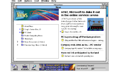
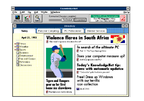
Figure 3. The Beta design for News in Computing.
Opening a News folder maintains the same structure
showing the contents list at this new level and more
highlighted stories, shown in Figure 3 above.
Development's view: a hierarchical structure with links,
powerful searching.
Management's view: a use model that affords rapid
viewing of many special interest areas by alternately
scanning either directories of information or editorially
controlled highlights pages.
The current design reflects the above goals. A clearer
picture should emerge when the stages of design are
described later on, but first it's helpful to know what the
present interface is like.
Do they get it?
Testing the appeal and performance of a service is different
than testing a software product or tool. Each time a
customer uses a service, they can choose not to come back
the next time. Instead of paying once for your product,
they decide to pay each time they use your service.
Performance was evaluated from task completion data and
observation. Acceptability and appeal were measured with
consumer testing instruments such as surveys and a line
scale. The acceptability scores were measured with line
scales to compare the overall appeal of the service with its
competitors, a concept statement describing the service,
and actual experience performing directed tasks. Our line
scale has intervals from Terrible to Excellent and the test
respondent marks each rating for their present experience
with a service (online users), the concept of Interchange,
and experience with the prototype on the same line. Thus
each rating is relative, accounting for 'hard graders'.
Top Two Categories -- This is an absolute measure of how
the service was rated. The respondent rates the prototype in
the very good to excellent categories on the rating scale.
Two Way Wins -- This is a relative measure of how the
service compares with a written concept statement
describing the service, and with a respondent's prior
experience. The respondent rates the service higher than
the concept and rates the concept higher than their previous
experience with online services, or their perception of
online services.
Over 130 people, taken from Ziff subscriber lists, were
tested with design prototypes over time as shown below.
Informal testing of specific design and content issues also
contributed to the evaluation of the design.
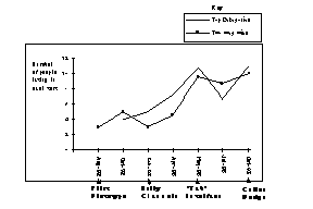
Figure 4. Ratings during iterative testing sequence.
Here's how our ratings have looked over time in Figure 4
above. Note that the top-two categories scores bounce
around, while the line-scale ratings for two-way-wins
represent a steady trend as we refined the design. These
scores have been normalized to a sample size of 12, which
is the typical number of respondents, though individual
studies have had as few as 10 and as many as 15
respondents.
Mac Users vs. PC Users.
Early designs were tested with both Mac and PC users. A
curious difference in attitude appeared in each group that
probably speaks more to the architecture of each machine.
Mac users were confident and told us what was wrong with
our design. PC users felt beaten down and said "I can learn
this, just give me more time or let me read the manual!".
What kind of an animal is this?
Another way we got a feel for people's perceptions of the
service was by asking projective questions like "if this
service were a person, what kind of person would it be?"
Later, we substituted �animal' for person and got
amazingly consistent answers, once people got over the
"this is a stupid question" feeling. The question seems to
reveal the most salient aspect of the service to each
respondent and whether it is a positive aspect or not. The
service was consistently compared to fast cats: "it's a
panther, sleek, powerful, and fast". Another frequent
comparison was made to animals that "go and get things
for you, like a retriever".
Figure 5. Panther, fast, sleek, and powerful.
Figure 6.Retriever, gets things.
Figure 7.Matrix organization with types of information on the left and Magazine products
across the top.
For a large information space this approach turned out to
be impractical. If you analyze the matrix, it's very similar
to a spatial metaphor, like a cityscape; you have to
memorize the locations along each axis. You have to
present a continuum to impose some ordinal discipline, like
a city street grid to make it useful. Without a continuum,
the axes are little more than a new list that requires
memorization. We could not identify a rational order for
information to make the matrix navigable. Another
problem was that some of the axes could not be filled in for
all combinations of choices, so this idea was dropped even
before lab testing.
A design using buttons on the left to represent sections of
the service (like channel changers on a television) and a
card that showed either highlights or a table of contents
controlled by a Directory button toggle (on the lower right)
is shown in Figure 8. The anticipated use model that lead to
this design was that a customer could flip through their
special interest areas by scanning either all of the highlights
or the contents very rapidly. Testing this design in the lab
showed the importance of directory information; nearly
everyone got lost trying to navigate between the content
and highlights. People had to sidestep highlighted stories
to get a view of the content in each section, never
developing any orientation. This was confounded by an
affordance problem; the channel changers on the left were
related to the Directory button on the lower right, but the
spatial separation made them look un-related. We had to
take the blame for rushing this design into the lab.
Fatigued by arguments from an influential member of
management, we tried his idea and may not have
implemented it well. Here is an unsolicited warning to
designers--listen carefully to management design
requirements, interpret rather than implement. Back to
Interchange, all subsequent designs were focused on
varying the balance of content on a highlights page as this
seemed the key to navigating.
Figure 8. Early Channel Changers: Highlights page with a separate Directory button (lower
right).
Figure 9. The Tab interface that was most successful, combining highlights and
context.
The other issue was that of navigating within a special
interest area or service. The hypothesis was that the first
page (highlights page) could serve as mix of hierarchical
order and show some story highlights at the same time, to
emerge as a hybrid structure. The contents of a section
were listed on the left with highlighted stories on the right.
This mix began to work very well in the lab, where people
began to find information without getting lost. The overall
ratings went up at this point (see May 93 in Figure 4).
It was generally felt among members of the design group
that there was too much graphical complexity at the top of
the window in the design previously described. A tool bar,
tabs for categories, window borders, and dividing lines for
stories added numerous horizontal lines. Lab respondents
remarked that it was �busy'.
Figure 10. Fox, clever.
Moving the features and status lines to the bottom gives
prominence to the content, which is more important than
the interface. There appears to be less interface. A layout
grid is used to locate all of the content in the window, and
the fonts are quieter. Screens are clean and screen
transitions are smooth due to a layout grid. The list of
directory buttons showing services on the left are more
scannable in vertical list format. Also, there is more room
for directory buttons.
Figure 11.Octopus, has it's tentacles everywhere.
Introduction
This design briefing describes how Interchange combines
logical hierarchical navigation with flexible searching and
hypermedia links in an electronic publishing platform that
takes advantage of editorial intelligence. Editors, as
experts in a specific field know what interests people. The
combination of editorial expertise with an easy to navigate
information space should provide the best of both worlds.
INTERCHANGE OVERVIEW
Interchange is an electronic publishing platform developed
by Ziff Communications and now owned by AT&T.;
Following the publishing model of providing very deep
special-interest information that made Ziff-Davis successful
in the print medium, the challenge was to build an online
service that provided customers with both powerful
functionality and ease of use. Also, because it offers
publishing partners modern editing tools, hypertext linking,
and control of membership revenues, it is the first online
service built specifically for a network of special interest
publishers.
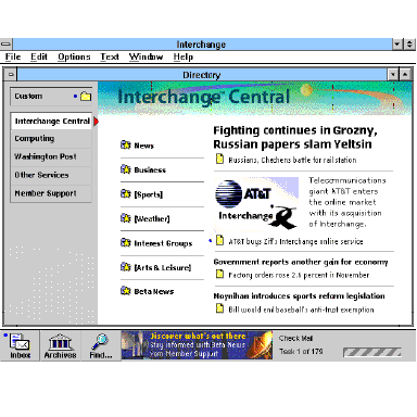
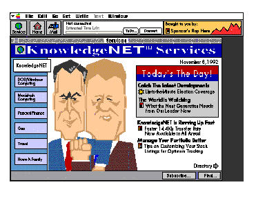
Directory View
The top level directory view of Interchange showing the
Central Directory Page open is shown below in Figure 2.
This directory view serves as a map or overview of the
entire network. Multiple services are available down the
left side of the window, listed on buttons below Custom.
The index to all of the content in Interchange Central is
listed to the right of the buttons. Some links to stories are
shown on the right, highlighting some important news, in
this case fighting in Russia and the sale of our company.
Competing Design Goals
Customers, editors, development, and management had
competing and seemingly incompatible goals.
Customers vs. Editors. For Interchange, efficient access to
information for service members was an important goal but
at the same time editors needed a way to call attention to
timely and important information. These goals were in
direct competition. In early usability testing potential
members of the service wanted a large table of contents to
browse, and mistook the graphics and some figures for
advertising, leading designers to think people want lists of
data, data, and more data (see 'using customer profiles'
below). But editors needed to present articles, software,
and news stories as highlights at many levels in the
hierarchy of contents, and many customers value this added
benefit of information filtering; it simply saves time to have
experts highlight important information.
CURRENT DESIGN
The Interchange interface was designed to allow simple
access to a vast body of information using a logical
structure that is complemented by highlighted or featured
items at each level. This standard structure serves to give
a sense of place and allow the serendipitous discovery of
information of interest. Three aids to information access
make this possible:
Giving Edit Credit
Information organized by editors using the means described
above creates an information space that is more than a mere
warehouse of data. When experts bring important
information to the forefront, it adds value, creates a shared
experience throughout the service, and for some reduces
the fear of missing information. In addition to highlighted
stories on directories, individual stories can have sidebar
links to related information. For example, a new software
product announcement could have links to the company's
history, past products, financial information, and a demo of
the product. A news story about O.J. Simpson could link to
photos, constitutional law, and even a news clipping of
archival football footage. Without editorial support,
navigation would be about as exciting as a library card
catalog. Observing people using Interchange in the lab, it
became increasingly evident that the mix of editorial effort
combined with a simple and attractive interface appealed to
both experienced online users and novices.
EVALUATION SUMMARY: ITERATIVE TESTING AND
DESIGN
Working with a prototype that was about a year ahead of
the development schedule, designers successfully tested the
interface with both experienced and inexperienced online
users well ahead of any code writing. Simple usability
procedures mixed with basic consumer testing acceptance
criteria were used to obtain qualitative feedback on the
design at very early stages. We were trying to answer 3
basic questions for the service:
Can they use it?
Do they like it?
Ratings Definitions (for Figure 4)
Two groups always tested.
Both experienced and inexperienced online users were in
every group tested. We were looking for differences in
their performance and overall ratings to make sure we
didn't build a service that only either experts or novices
would like. Twelve people were tested in each formal lab
that we ran, acting sort of like a jury: when we got near
unanimous opinions or performance on a design issue, the
changes to make were very clear.
Using Customer Profiles
When looking at diverse users, we found it helpful to
categorize different types of customers according to their
motivations, traits, and skills. This helps when observing
their behavior during testing. Without them it would be
easy to get pulled in many directions by seemingly
contradictory opinions and behavior. For example, if you
know someone is a 'database diver', they generally will not
value editorially formatted information spaces but will look
for powerful searching tools.
Some Anecdotes.
EARLY DESIGNS: NO, IT'S THE INFORMATION.
People come to an information service for the content, not
the interface. Often the interaction is what needs design
more than the interface. The rest of this briefing shows
evolutions of the design and will focus on information
design issues, specifically the way the highest levels of the
service evolved to a simple hierarchy that balances context
with content. To get the right mix of content organization
and the contextual cues needed for orientation in a
hypermedia space, the design moved through various
stages including a matrix, a dual card directory (Early
Channel Changers), and hybrid directories of information
(Tab Design) up to present. Many issues around the use of
a table of contents for each successive section of the
service to maintain context (directory) will be explored.
Organizing Information in a Matrix
Early attempts at organization used a matrix with
publishing products on one axis and different types of
information on another. Picking any two points on the axes
would show the intersection, in this case, Computing and
News, in the center screen as shown in Figure 7.
Fighting for Space on the Front Page
Satisfying the competing design goals previously
mentioned would take more than a matrix. Focusing on the
use model that management suggested, the next design
addressed scanning special interests and deliberately
separating navigation and content.
Finding the Right Mix: a Balance of Highlights and
Context
One of the next designs split special interest areas among
folder tabs, and combined highlights with directory lists
within each area, as shown in Figure 9. There are two
separate issues here: Navigation between services on the
network and navigation within a service. Folder tabs were
used as a familiar metaphor for separating services.
Usability Testing : "How do you know when you're done?"
or "It tested well but we are still not happy"
We all know there are limits to usability testing--you
cannot test good design into a product or get users to solve
your problems. You can only try to reduce the number of
problems customers have. Designers are very good at
taking extremely diverse requirements and putting together
solutions. One scheme used throughout the design effort
for was to remind ourselves of a set of high level
objectives, or a mantra. For Interchange, it was �EMP',
standing for Elegant, Modern, and Professional. The tab
folder interface was not.
Moving to the Current Design
The cleaner look of the current design (Figure 2.), with
Directory buttons down the side and feature buttons at the
bottom, drew excitement from a majority of lab
respondents. There was no statistically significant measure
for this, in terms of ratings, but everyone observing the labs
could �feel' the difference.
SOME OTHER LESSONS LEARNED
These are a mix of other things not really detailed here that
we believe we did right and some we did wrong but learned
from them just the same:
CONCLUSION
Thanks to constant refinement and iterative testing, the
design of Interchange offers efficient access to a large
information space. As a result of our taking advantage of
editorial intelligence and integrating the mapping of
contents with highlights, users found that orientation was
less of a problem in hypermedia.
Acknowledgments
The work presented in this briefing reflects the
collaborative efforts of many people including Dave
Rollert, Marty Gardner, glenn mcdonald, Cynthia
Shanahan, Maethee Ratnarathorn, Karen Tichy, Cindy
Augat, Andrew Kleppner, Kevin Wells, Andrew Knight,
Charles Dao, and Judy Marlowe. Many members of the
development team (responsible for architecting and coding
the software) participated actively as well. Thanks also to
Matt Belge for review comments.